Sunday, September 23, 2012

Roy Lichtenstein Landscapes (4th Grade)

The 4th graders and I looked at the Pop artist Roy Lichtenstein.  Lichtenstein had a very unique style of painting.  His work resembled that of comic books!  He worked a lot in primary colors and he used the black bold outline in a lof of his paintings.  The 4th graders also learned the new term of "benday dots".    Those are the tiny little halftone dots that Lichtenstein used in his paintings.
For this project, students were asked to draw a pop art landscape.  They were to paint the picture in only the primary colors as their creative challenge.  I also asked the students to incorporate some benday dots in their painting as well.  I think it's safe to say I'm in love with all of their final pieces of work! Soooo
cool!!


Paul Klee Abstract Name Designs (3rd Grade)

In 3rd Grade we looked at the artist Paul Klee.  We have been studying shapes this quarter in 3rd grade,  and this project focused on Geometric shapes.  Klee uses a lot of squares, rectangles and triangles to make abstract works of art.  We also talked about the work abstract and what it means.
In this project students were to create an abstract design of their name or chose a sentence that represents them.  The students drew it in pencil then colored in their shapes with oil pastel.  Then they went over the lines with a black oil pastel.  Last the cut it out and glued it onto a background of their choice.  Can you tell what they say??


Geometric Cityscapes (2nd Grade)

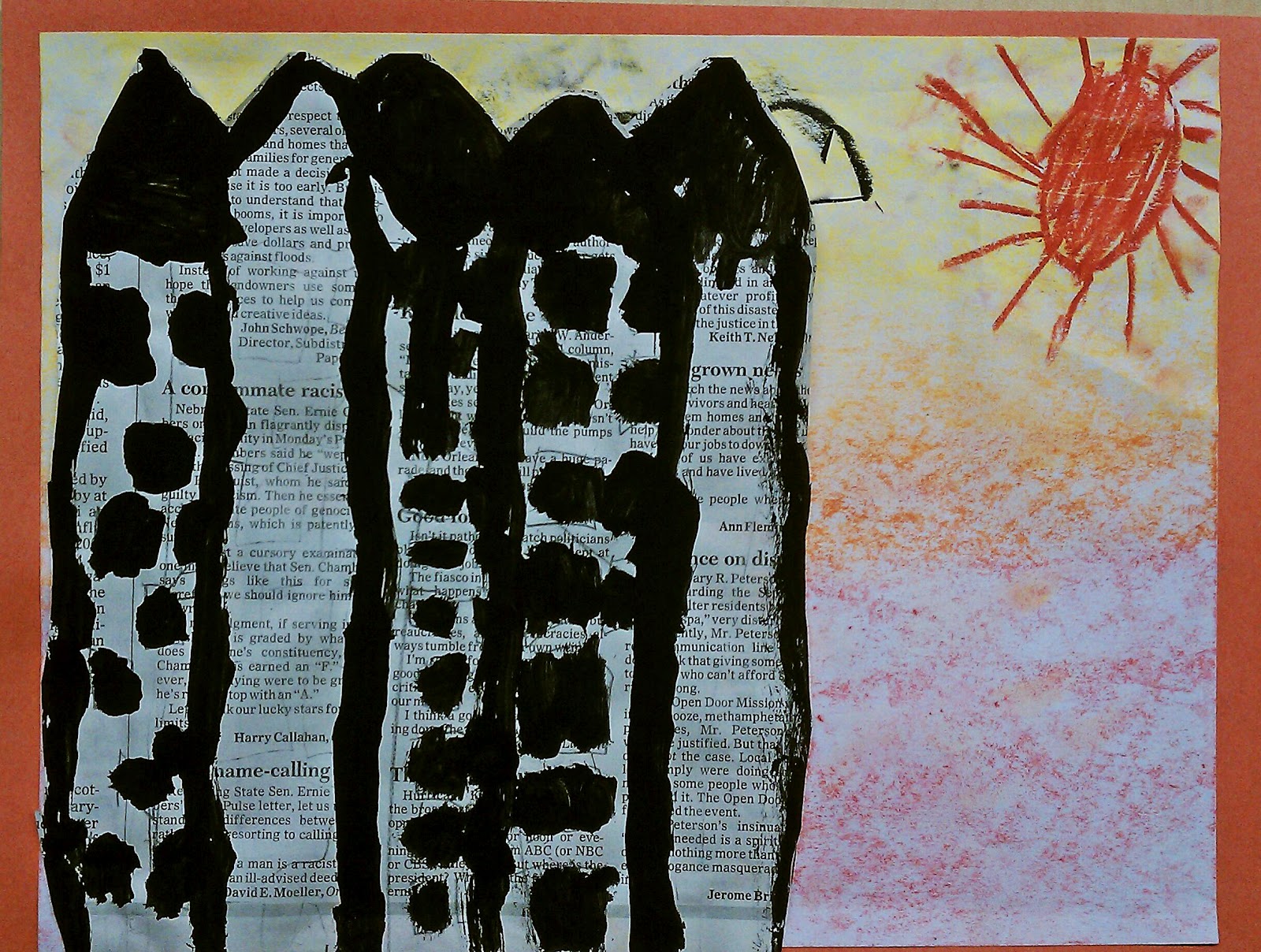
In 2nd Grade we have been talking a lot about shapes! In this lesson we focused on geometric shapes.  We talked about how the buildings in our cityscapes are all very linear and geometric.  We made a lot of squares, rectangles and triangles in out artwork.
First the students drew a cityscape in pencil on newspaper (yes, we are green artists too!).  Then they painted with black tempera paint over their pencil lines.  Next, we made out sky.  I told them to chose either warm colors, or cool colors to make their sky.  The sky was made with chalk pastel and they students held the chalk sideways while they colored with them.  Then the students chose a piece of colored paper for their background.  Last, they cut out their city and glued it onto their sky background.  A lot of steps and direction following but they turned out awesome!


Upstream Salmon (1st Grade)

In 1st grade we've been talking a lot about overlap and space.  In the Upstream Salmon project, students were encourage to overlap some of their fish and make some small and some big to show space.  First, we drew our salmon in black oil pastel.  Then we used white and gold paint to add accents to the fish. Next, we painted white squishy swirly marks on blue paper for water.  Last, we cut out the salmon and glued them onto the blue water background.


Jasper Johns ABC Art (Kindergarten)

In Kindergarten we looked at the artist Jasper John's and his alphabet paintings for this lesson.  We talked about the and the texture we would make in our ABC art!  First we wrote our alphabet in the squares using crayons.  Then we painted over the letters using watercolor paints (wax resist technique).


Monday, September 10, 2012

Organic Shape Monster (2nd Grade)

In this lesson we talked about shapes! Particularly organic shapes.  We also talked about textures and patterns that we could design our monster with.  Here is how it works:  Each student was given a string that was tied end to end into a circle.  They students laid the string on their paper to make a natural organic shape.  They then used a black oil pastel to trace around the outside edge of their string.  They then took the string off the paper to reveal their shape! They used the shape to create a monster out of oil pastels.  They then cut them out and glued them onto a piece of colored paper of their choice.  


Chalk Pastel Cakes (6th Grade)

My 6th graders made some yummy cakes this week!  In this project we talked about contour line drawing as well as texture and color.  The students were given a black piece of construction paper and they were to draw the outlines of their cake design. We went through a mini perspective lesson as well for those students who wanted a slice of cake taken out of their cake. Then they used chalk pastels to color in their cakes.  Once the design was colored in with chalk, they took a black oil pastel and gave the drawing a graphic look with the bold black outlines.


Jim Dine Hearts (4th Grade)

The 4th graders and I took a look at the Pop artist Jim Dine and his heart paintings.  In this lesson we discussed warm and cool color families.  The students made a heart stencil and drew 4 hearts using oil pastels. Two of them had to be from the warm family and two of them had to be from the cool family.  Then we used watercolor paints to paint background of our blocks.  The students were to paint the background the opposite of the heart (i.e.  if they had a cool heart they were to paint the background a warm color).


Thiebaud Gumball Machines (1st grade)

The first graders and I looked at the artist Wayne Thiebaud's gumball machine painting.  The first day we all chipped in and painted sheets of scrap paper (Eric Carle style, using plastic forks for texture) to make our gumball circles out of.  Also on the first day, I gave the students a red, black and white oil pastel and we drew our gumball machines together.  We then put in our shadow next to our machine. The next day we divided up the painted paper and cut our gumballs of them.  I talked to the students about overlap and space and encouraged them to show overlap in their gumball machines.

Wayne Thiebaud's Gumball Machines


Matisse Shape Collages (3rd Grade)

We learned about shapes in this Matisse lesson!  The students learned what makes a shape a shape (it has to have lines that connect) and they also learned the difference between geometric and organic shapes.  First we made a colorful backdrop for our shapes out of tissue paper.  I encouraged the students to overlap their tissue paper to invent new colors.  Once the tissue paper was finished, the students cut out various geometric and organic shapes out of black and white construction paper to finish their design.


Kinder Warhol Flowers (K)

In this lesson the Kindergartners beckoned the famous pop artist Andy Warhol!  We looked at Warhol's flower prints and discussed line and shape.  The students used black construction paper and printed green neon paint with a "grass stamper" (a cut up piece of matte board).  Then the students drew flowers and cut them out.  They added the centers to the flowers and then glued them onto the grassy background. Voila!

Warhol's flowers

The Kindergartner flowers! 


Thursday, September 6, 2012

Organic Line Fish (2nd Grade)

In this project, the 2nd graders and I talked about organic lines and contour drawing.  The students were instructed to draw  an organic "loopy" line.  They were to go slow and controlled with the line.  They were to draw at least 4 loops, and they need to make the loops big enough to turn them into fish.  The fish were drawn in sharpie marker, no pencils allowed! We talked about adding a lot of detail and texture to the fish.  Once they drew their fish they used watercolor paints to make the fish colorful!


Friday, August 24, 2012

Zentangle!


The 2012-2013 school year is off and running! All grade levels are participating in a technique know as Zentangle!  It is a very structured doodling process that teaches the students about line, texture, and patterns.  It also teaches them the value of taking your time and creating marks with a purpose.  Each grade level did a zentangle using a different approach. They turned out so great!

6th grade

6th grade

4th grade

3rd grade

3rd grade

3rd grade

1st and 2nd grade

1st and 2nd grade